Gambas文档
编译和安装
错误消息
代码片段
翻译
废弃的组件
教程
开发环境文档
开发文档
名词解释
如何操作
说明
维基手册
维基搜索
维基许可协议
文档
应用程序仓库
语言概览
语言索引
主题
组件
gb
gb.args
gb.cairo
gb.chart
gb.clipper
gb.complex
gb.compress
gb.crypt
gb.data
gb.db
gb.db.form
gb.db.mysql
gb.db.odbc
gb.db.postgresql
gb.db.sqlite2
gb.db.sqlite3
gb.dbus
gb.dbus.trayicon
gb.debug
gb.desktop
gb.desktop.x11
gb.eval
gb.eval.highlight
gb.form
gb.form.dialog
gb.form.editor
gb.form.htmlview
gb.form.mdi
gb.form.print
gb.form.terminal
gb.gmp
gb.gsl
gb.gtk
Button
Click
Picture
Value
ComboBox
Container
Embedder
Font
Panel
trayicon
trayicons
gb.gtk3
gb.gtk3.opengl
gb.gtk3.webview
gb.gui
gb.gui.qt
gb.gui.qt.ext
gb.gui.trayicon
gb.gui.webview
gb.hash
gb.highlight
gb.image
gb.image.effect
gb.image.io
gb.inotify
gb.logging
gb.map
gb.media
gb.media.form
gb.mime
gb.mysql
gb.ncurses
gb.net
gb.net.curl
gb.net.pop3
gb.net.smtp
gb.opengl
gb.opengl.glsl
gb.opengl.glu
gb.opengl.sge
gb.openssl
gb.option
gb.pcre
gb.pdf
gb.poppler
gb.qt4
gb.qt4.ext
gb.qt4.opengl
gb.qt4.webkit
gb.qt4.webview
gb.qt5
gb.qt5.ext
gb.qt5.opengl
gb.qt5.webview
gb.qt6
gb.qt6.ext
gb.qt6.opengl
gb.qt6.webview
gb.report
gb.report2
gb.sdl
gb.sdl2
gb.sdl2.audio
gb.settings
gb.signal
gb.term
gb.test
gb.util
gb.util.web
gb.v4l
gb.vb
gb.web
gb.web.feed
gb.web.form
gb.web.gui
gb.xml
gb.xml.html
gb.xml.rpc
gb.xml.xslt
最近的修改

Button (gb.gtk)

This class implements a push button control.

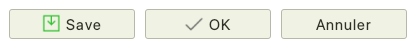
A push button can display text, a picture, or both.

One button inside a window can be the Default button. Pressing the RETURN key will activate the button automatically.

One button inside a window can be the Cancel button. Pressing the ESC key will activate the button automatically.

该类继承于 Control.

该类是可创建

属性
AutoResize  
Border   Returns or sets if the control has a border.
Cancel   Indicates if the button is activated when the ESC key is pressed.
Caption   This is a synonymous of the Text property.
Default   Indicates if the button is activated when the RETURN key is pressed.
Picture   Returns or sets the picture shown into the button.
Text   Returns or sets the text displayed in the button.
Value   Sets this property to TRUE to activate the button.

Inherited properties
Action  
Background   Returns or sets the background color used by the control.
Cursor   Use this property for assigning a custom cursor to a control.
Design   Indicates that the control is in design mode.
Direction  
Drop   Returns or sets if a control accepts drops.
Enabled   Indicates that the control is enabled.
Expand   Returns or sets if a control will expand if included in a container that arranges its contents.
Font   Returns or sets the font used to draw text in the control.
Foreground   Returns or sets the foreground color used by the control.
H  
Handle  
HasFocus  
Height  
Hovered  
Id  
Ignore  
Left  
Mouse   Returns or sets the appearence of the cursor when it points inside the control.
Name  
Next  
NoTabFocus  
Parent  
PopupMenu  
Previous  
Proxy  
RightToLeft  
ScreenX  
ScreenY  
Tag  
Tooltip  
Top  
Tracking  
Visible  
W  
Width  
Window  
X  
Y  

Inherited methods
Delete  
Drag  
Grab  
Hide  
Lower  
Move  
MoveScaled  
Raise  
Refresh  
Reparent  
Resize  
ResizeScaled  
SetFocus  
Show  

事件
Click   Raised when the user clicks on the button.

Inherited events
DblClick  
Drag  
DragLeave  
DragMove  
Drop  
Enter  
GotFocus  
KeyPress  
KeyRelease  
Leave  
LostFocus  
Menu  
MouseDown  
MouseDrag  
MouseMove  
MouseUp  
MouseWheel